Tag: vintage postcards
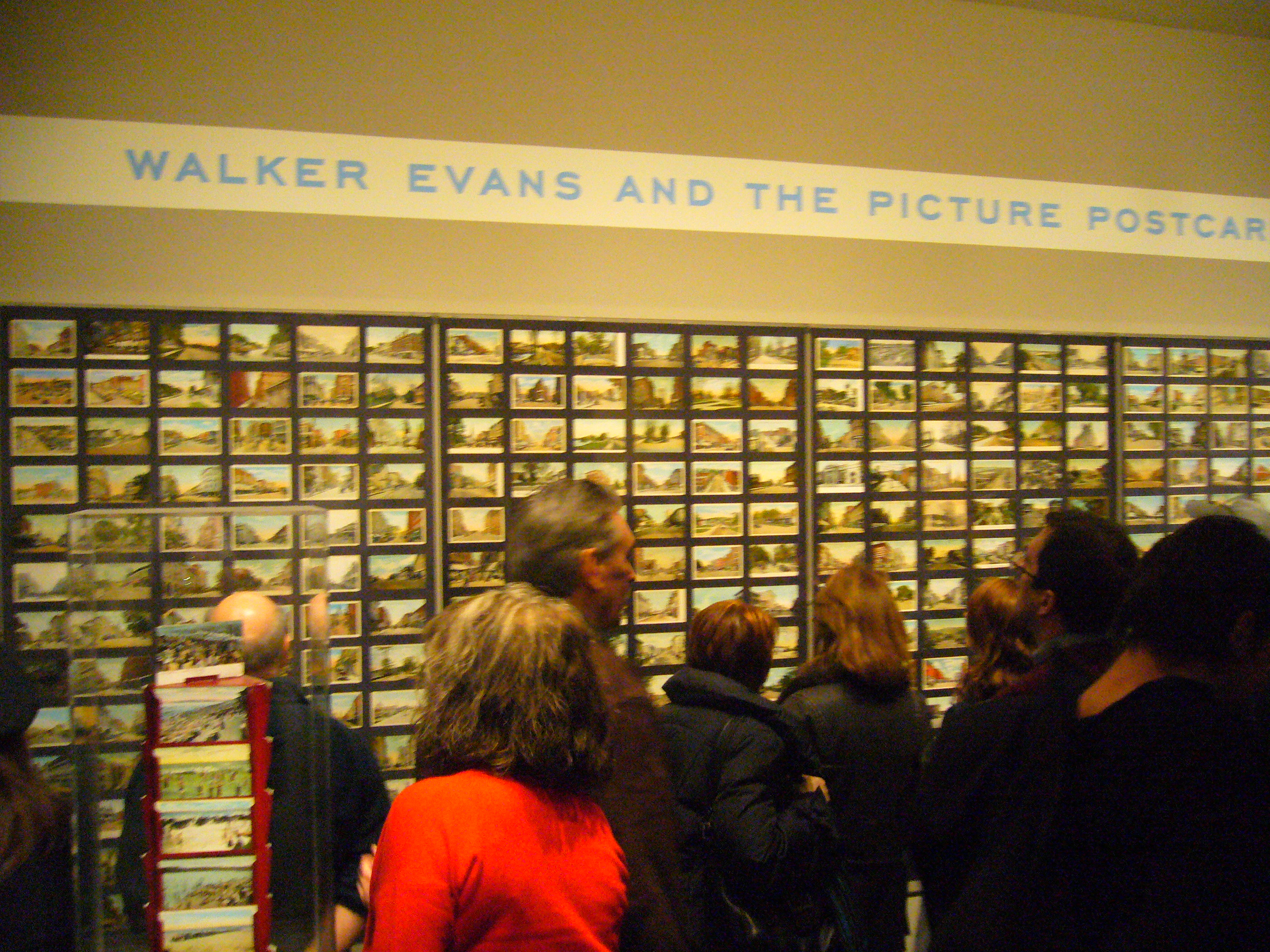
When The Factual Ages Into The Sentimental
Crowd squeezed into relatively small galleries of the exhibition “Walker Evans’ and the Picture Postcard” at Met on last Sunday afternoon. On any given wall, there were probably as many heads staring and commenting as the number of postcards displayed on grids.
However, few may realize or care about the curatorial perspective behind the exhibition: the relationship between the factual characteristics of postcards of common places with Walker Evans’ lean anti-arty photograph style. All visitors were busy: They were busy in finding what a piece of common place that they know of looked like before the great war.
Postcards are manufactured as a record of present; yet through the hands of collectors, they become proof of what was there or more often what was not there, thus arising memory of inevitable loss of past and resignation of nothing could stay perpetual in the perpetually changing world.
The acute pain can be felt more evidently in those “main street” postcards where common places, neatly laid out if somewhat lack of individuality, now become rusty and even ghostly. One example is a postcard of East Liverpool, OH: a small town along Ohio River. I once stopped there briefly for its antique stores. Near downtown, those brick buildings were very impressive, but the faded commercial signs on the side walls were from different eras. I wandered through some antique stores which were piled with stuff that it may take years to look through every item. There I bought a book about 19the century American art, which I never read. It was a hot summer weekend day. The air was stagnant. The town quiet and devoid of people. It was hard for me to believe that East Liverpool was the Pottery Capital of the World at one time.
One woman in the exhibition was commenting on another postcard of a town in Rhode Island. It was in the same tone. “It still looks like that. Almost, except there is no…” She knew she was wrong when she kept examining the difference. Architectural integrity of the Main Street was not on the agendas of those common places. They changed, not because of age , but mostly because of human intervention.
New York scenes have a large proportion in Walker Evan’s collection. I have found those pictures of theme parks in Coney Island irresistible. The factual documentation in these postcards look more like fairy land, because that’s what theme parks were. It is a place in the era when mundane living devoured much of personal spare time, where people could behave what they wanted, not what they should, where people of diverse background shared prime joy and scare for everything exotic and unusual.
For me, that is arty. Thanks Evans.
——————————————————
The exhibition comes with a catalog book with extensive reproduction images of postcards from Evans’ collection. Below is the cover of the book.
Changes in American Postcards

Courtesy to Metropolitan Museum of Art. Unknown artist Main Street, Showing Confederate Monument, Lenoir, N. C., 1930s Postcard, Photomechanical reproduction; 3 1/2 x 5 1/2 in. (8.9 x 14 cm) The Metropolitan Museum of Art, New York, Walker Evans Archive, 1994
Just after I posted the previous article about vintage postcards of Grand Army Plaza, “Walker Evans and the Picture Postcard” exhibition at Met has gone into its second week. Thanks to Lon Black, with whom I talked in the Dumbo Flea Market yesterday, I learned the basic eras and milestones of American postcards.
Like collecting other things, postcard collecting needs not only passion but also knowledge. On one hand, the anonymity of the real photographer behind each design, or the absence of names of the women artists who hand-colored some postcards in an assembly line workshop, makes collecting less complicated since postcards collection are not centered around artists. On the other hand, there are postcards of almost every subject. Selecting a right perspective (subjects such as cities, parks or railroads, printing techniques and material like B&W, hand-colored, linen, etc) thus is critical to form a well-curated collection without being lost in the abundant availability.
Postcards have been inexpensive from the very beginning and most of the vintage postcards are affordable and their price ranges from equivalent to a McDonald meal to a fancy Italian Bistro dinner. But Lon said some early postcards (dated in 1870′s) can fetch thousands of dollars due to its scarcity.
Rosenheim, the curator at Met who organized the current exhibition “Walker Evans and the Picture Postcard“, said “Postcards are a democratic form. They are about everywhere in particular. And there was no nostalgia about them. They show the new banks, the new factory, the new school. They were a clear expressions of the present.”
If identification of the specific location in each postcard can be challenging, the identification of the era of each postcard is easier thanks to the dated events for format change or technology breakthroughs.
Here is a summary of milestones with respect to changes in American postcards based on the article “American in 3 by 5” by Thomas Hine in February issue of Magazine Antiques and the conservation with Lon Black yesterday.
| Year | Milestone | Event | Characteristics |
|---|---|---|---|
| 1873 | Pre-stamped postal cards | First time postcards on US markets | Plain, only address allowed in the front |
| 1898 (May) | Private Mailing Cards | Private Mailing Card Act passed by Congress. Beginning of increased popularity | Undivided Back, with title “Private Mailing Card” on each card |
| 1901 (Dec) | “Postcard” can be used by privately printed cards | “Private Mailing Card” title began to disappear | Writing was still only allowed on the front of picture side of the card |
| 1907 | Divided Back (The back of cards were used for both the address and for any message) | Beginning of Golden Age of postcards | The majority of the print was done in Germany for the best printed method |
| 1908 June 30 | 677,777,798 postcards mailed in the fiscal year | US Population was 88,700,000 | Public addition of postcards of everything |
| 1915 | WW1 brought the supply of postcards from Germany to an end | Quality dropped. Telephone began to replace postcards as a way of communication | Some cards published in England or US |
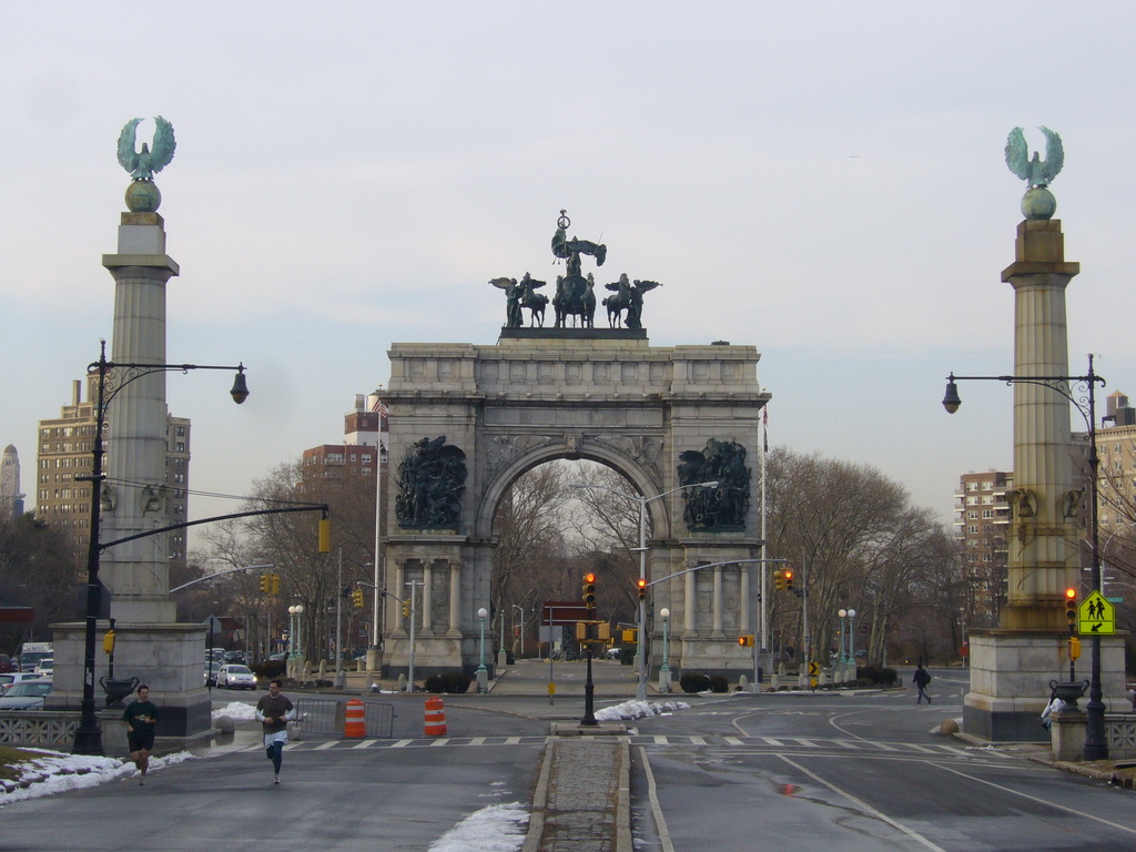
The Vanishing Points — The Transformation of Grand Army Plaza Through Viewing Vintage Postcards
Back in Pittsburgh, I never thought I would have a thing for postcards. After all, they were products of mass production (to some degree). It was after I moved to Brooklyn that I discovered the pleasure of reading vintage postcards.
Perhaps there is no other place than New York that vintage postcards hold the wonderful collectible values. For a city which has been rebuilding itself so many times, postcards provide an extravagant visual experience of “then and now” in indefinite scale. Not only that one can find the great rendering of the vanished buildings such as Penn Station, the Wardorf-Astoria Hotel, the Vanderbilt mansions, but also some less known architecture or statues in other boroughs including Brooklyn and Queens.
My personal experience brings my attention to the so-called the cultural mile of Brooklyn: the Eastern Parkway (the world’s first parkway) stretching from the Grand Army Plaza (GAP) to the Brooklyn Museum, both of which can be found in plenty of vintage postcards.
A lot of early postcards of GAP dated between 1892 and 1902. The relative abundance from this period indicates that Broolynites’ pride and joy in the grandeur of the park entrance and the arch designed by McKim, Mead and White. Devoid of automobile traffic, the plaza is reminiscent of European neoclassicism; yet the large empty space around the arch declared it American: Here, with enormous growth in wealth and confidence of the late Gilded Age, the order, dignity, and harmony of the old civilization still hold, but on a bigger and more ambitious scale.
I always have a vision that someday the GAP would be changed back to its original design of the last 10 years of the 19th century. There are several points which makes this postcards version much more attractive.
First and most importantly, there was no “traffic” as we know it in the early days of the Plaza. The American grandness became deadly with the advent of automobile. Unlike the European plazas which were squeezed into a smaller space, the undeveloped land around GAP made it a victim of traffic. As early as in 1927, a “Death-O-Meter” was installed at the plaza to track the automobile fatalities. Since the 1950s, the GAP has been a sea of cars and traffic lights. The plaza circular traffic pattern makes it a suicidal adventure for anyone wants to enter the plaza which is an island surrounded by endless traffic flow.
Second, there were no dominating buildings around.
The Eastern Parkway was a patch of green at that time. A water tower of the Mount Prospect Reservoir dominated at the southeast corner of Flatbush and Eastern Parkway where the Brooklyn Central Library is. It was on that corner where August Saint-Gauden’s Henry Maxwell Tablet was originally located. One of the postcards show the tablet with the background of the reservoir water tower. In 1912 the monument was moved to the east side of the plaza. It reportedly took a week and ten horses to move the boulder over 400 yards distance. Due to repeated vandalism in the past, the restored tablet is now at the ground level (staff entrance) of the Brooklyn Museum, where Henry Maxwell sat on board for 6 years. A reproduction tablet is now mounted on its original boulder at St. Johns and Plaza Street.
The relocation of a giant boulder did’t change the overall structure of the plaza, but a few buildings did. The central library, started in 1912, took almost 30 years to finish. Although the entrance recalls the colonnades of the park entrance designed by Sanford White, the rest of the building, with its simplistic geometric form, reflected an Art Deco influence. Richard Meier’s On Prospect Park has a less damaging effect, partially because the colored glass can be absorbed in the sky or works as a smooth textureless backdrop for statues around the plaza.
Third, the early postcards show that the group statues of “The Spirit of the Army” and “The Spirit of the Navy” by MacMonnie was not mounted. Geo always comments on a desire for the monument to be in a simpler form. The two statues, although heroic, intense and storytelling, break the elegant lines of the arch designed by John Duncan. With additional two relief sculptures of Lincold and Grant by William O’Donovan and Thomas Eakins (Eakins only did the horse part), the arch was much more a show piece of the historical sculpture than a grand piece of architecture alone.
Another late addition to the sculpture group around the GAP is the MacMonnie’s General Henry Warner Slocum. The statue was located at Bedford Ave and Eastern Parkway when it was dedicated by Teddy Roosevelt. One postcard shows it facing westward, an integral part of the ornamented parkway that leads to the park. It was moved to its current small slope in the late 1920′s. In my opinion, it was a successful move that united the works by MacMonnies together (Quagriga, The Spirit of the Army, the Spirit of the Navy, Park Commissioner James Stranahan) and linked General Slocum in the context of civil war (His funny nickname was slow come for his Gettysburg performance). On any sunny day, the statue resolves into or emerges from the glass backdrop of On Prospect Park depending on the cloud conditions. The general rides his horse in his commanding pose, toward the direction of the Green-wood cemetery where he is buried.
I have not seen a postcard with Henry Kirke Brown’s Lincoln statue in GAP. The 8-foot tall statue was regarded as too imposing during the transformation period of the 1890′s and relocated to the concert grove. Similarly, postcards with the gas lit fountain designed by Calvert Vaux are also rare since the fountain was regarded as too rusty and was replaced by an electric fountain in 1897. Interestingly, not many postcards can be found with this spectacular fountain which drew more than 100,000 people on its opening night with its shifting colors and every-changing spouts. Possibly this is because the fountain was shortlived (only 18 years later the BMT and IRT subway lines construction necessitated the removal of the fountain.), possibly because the beauty of its color at night could hardly be fully captured in the early postcards. The current Bailey Fountain was built in 1932. The restrained curve and elongated body forms of the pair of nudes figures are quintessentially art deco style.
The last myth of the GAP was the missing statue of John. F. Kennedy on the north part of the plaza. I have seen a postcard with the statue which was erected in 1965. It was only recently removed (Oct 2003) that even the New York Department of Park and Recreation still lists the statue in its website. In fact it is in the Picnic House of the Prospect Park now.
Here is a short version of the complicated story. Neil Estern, a Brooklynite sculptor, hated the pedestal JFK was put on from the very beginning. By the time the granite pedestal was done in 2003, Mr. Estern’s old JFK was no good. Based on a Smithsonian Institution survey, graffiti stained so deep that scrubbing them off had worn away the inscriptions which has the famous saying: “Ask not what your country can do for you as what you can do for your country.” The bust itself looked like it had been whacked by a bat. Instead of having a new one cast, Estern saw some places sculpture could improve. Now his work is complete and all the city has to do to put JFK on the plinth is to find a $70,000. Will that happen in 2009?
———————–
If you are interested in collecting the vintage postcards, stop by at Brooklyn Flea in Dumbo every weekend. Lon Black, a knowledgable dealer has a variety collections of vintage postcards covering almost every aspect of New York City.


Recent Comments